Dashboard
Using the Dashboard
The dashboard website can be found here. Project data stored in REDCap will be aggregated and converted using the "Shiny" package in R on the dashboard website. We offer this tool to provide some insight to ICR projects, make information more widely available, and as an accessible source of project updates for ICR researchers.
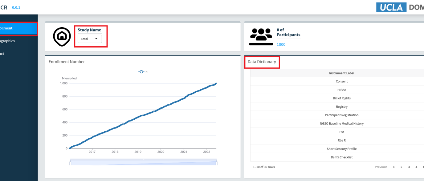
The default view of the dashboard, enrollment, displays enrollment numbers of studies within the ICR. From a drop-down menu, select the study you are associated with or interested in to start the process. Enrollment data, including time of inclusion into the study, number of total participants, and the types of instruments used in the study will be displayed. The data dictionary, or list of study instruments, can be sorted and is searchable to allow you to determine whether this study would be one you would like to participate in. The slider below the graph sets the time-frame for the data displayed.
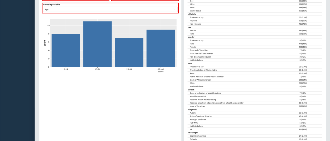
The second view, accessible in the side menu under demographics, provides a visualization of study participant data. Interactive graphs can be generated based on multiple variables, allowing for sub-group inference. Simply hovering over the graph elements will bring up more detailed information. A table of participant demographics can be found on the right. All aggregated information can be downloaded as a .csv by selecting the "Generate report" button.